⚡ Key Highlights & Quick Takeaways
- The story so far: The African Union (AU) has endorsed the ‘Correct the Map’ campaign to replace the Mercator map projection with alternatives such as the Equal Earth map.
- When a ship follows a fixed compass direction, the path it traces – called the rhumb line – is a curve on most flat maps.
- This made it awkward for sailors to translate a bearing into a usable course they could plot on a chart.
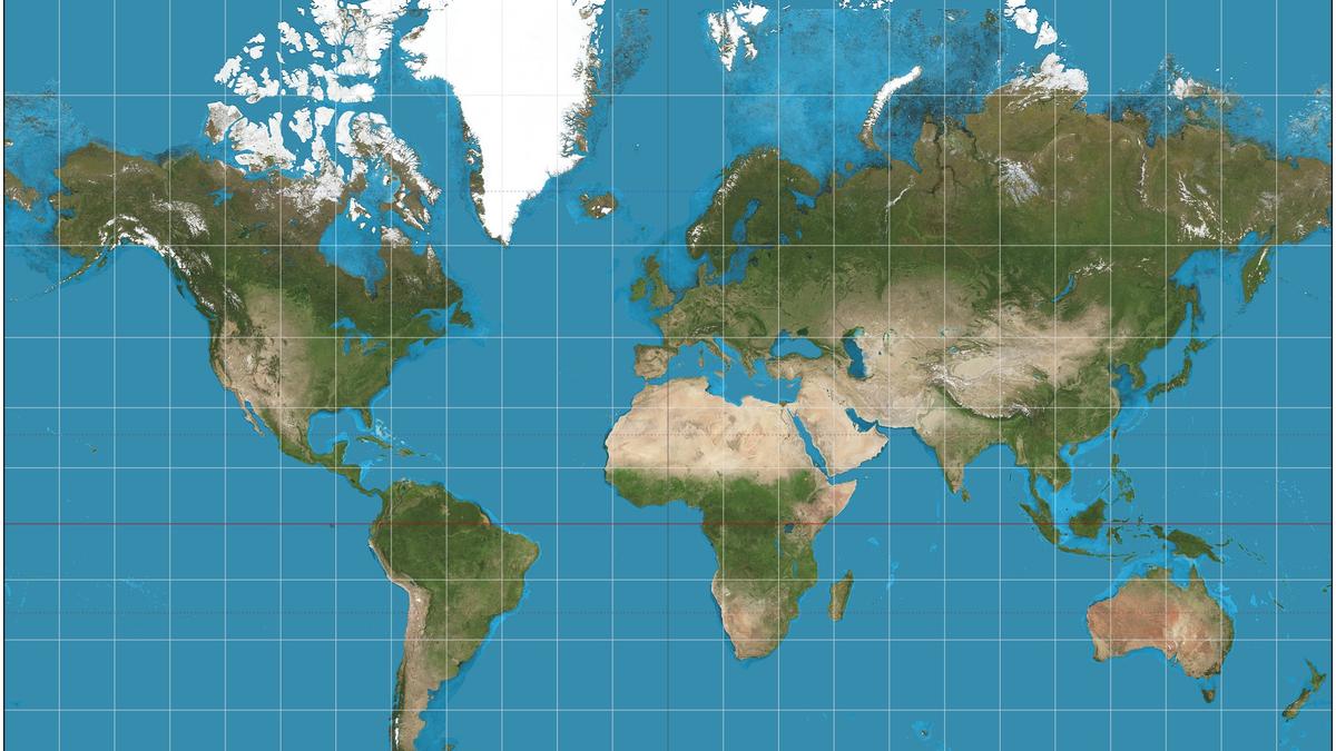
The story so far: The African Union (AU) has endorsed the ‘Correct the Map’ campaign to replace the Mercator map projection with alternatives such as the Equal Earth map. At the heart of this demand is the charge that the Mercator projection, still widely used in schools, media, and online platforms, systematically distorts the sizes of landmasses, shrinking Africa while inflating Europe, North America, and Greenland. By backing the call, the AU has expressed hope that a fairer projection will restore geographical accuracy and correct what it characterises as centuries of symbolic marginalisation.
The Mercator projection was designed in 1569 by Flemish cartographer Gerardus Mercator, who was trying to solve a navigation problem. When a ship follows a fixed compass direction, the path it traces – called the rhumb line – is a curve on most flat maps. This made it awkward for sailors to translate a bearing into a usable course they could plot on a chart.